

This Or That (Flexbox Or Grid)


Welcome to the first part of my "This or That" series. In this series I would be talking about similar values in CSS and I'll examine where either of them can and should be used. That being said, let's get right into it.
Introduction
"Flexbox or Grid" is one of the most debated topics by developers who use CSS or any of it's frameworks. I'm writing this to show when either of them is meant to be used. Before that, let's learn their meanings?
What is Flexbox?
Flexbox or Flex is a one-dimensional method of layout, the elements can be displayed in row OR in column. These elements can be made to grow or shrink to the space available.
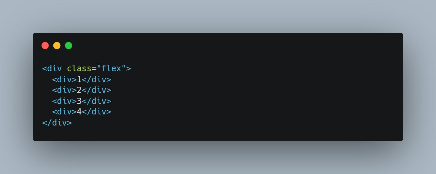
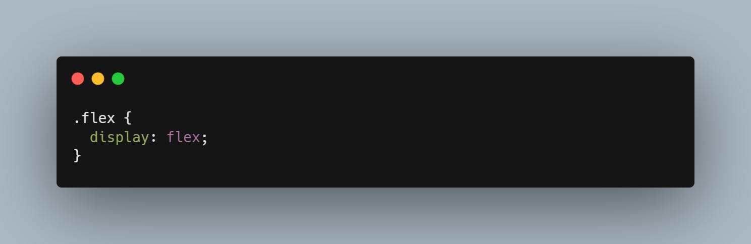
Implementing a Flex Layout:
What is CSS Grid?
Grid is a two-dimensional layout system, it allows you to lay elements in row AND column. You can create a fixed track size for your grid using you desired number of pixels or you can create a more flexible one using the "fr" unit.
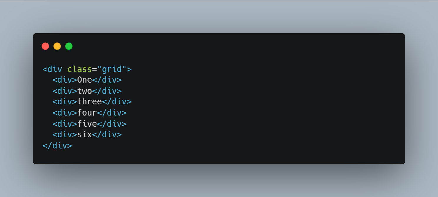
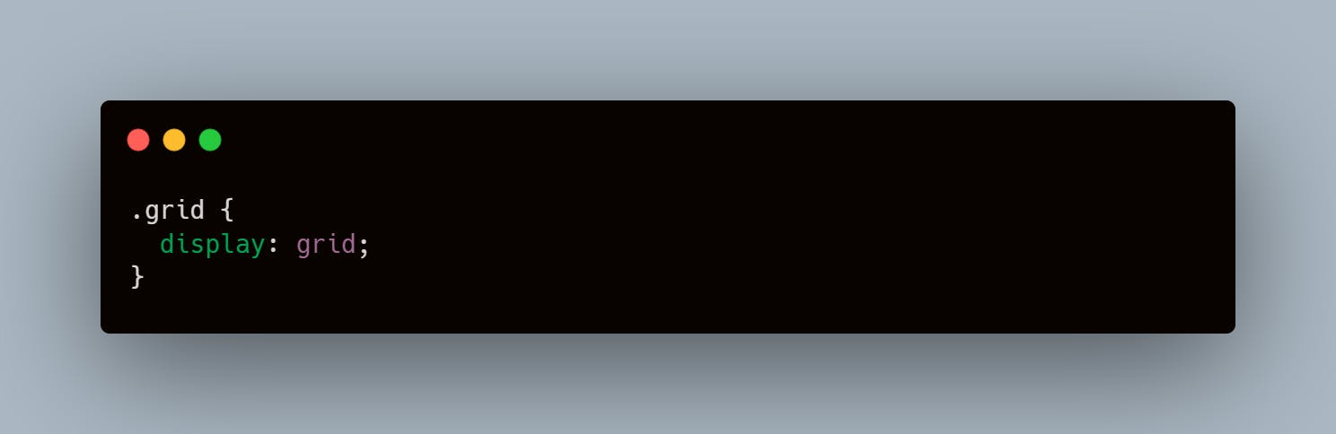
Implementing a Grid Layout:
Next Up, What features do they possess?
Firstly, Features of Flexbox.
One of the Best features of Flexbox is the one that allows it to Align and Justify items on it's main and cross axes, Another of it's interesting features is it's ability to distribute space to it's the elements contained in it.
Flexbox is also one of the best when it comes to centering divs which is also a popular problems among developers. Some other features worth mentioning are:
(a) flex wrap: This allows you to set the flex item to either overflow or continue on the next line.
(b) flex direction: This allows you set the direction of the items. The directions you can set them to include: row, column, row-reverse, and column-reverse.
(c) flex-flow: This is a shorthand feature that lets you set the flex direction and wrap value on the same line. It takes the direction value first and the wrap value at the end. It usually looks like this: flex-flow: row nowrap;
(d) flex basis: This sets the initial size of a flex item.
(e) flex-grow: This specifies how much of the remaining space should be assigned to a flex item.
(f) flex-shrink: This makes an item reduce in size to fit into the flex container, it reduces to the size specified based on the amount of space left in the flex container.
Features of grid.
When it comes to centering a div, Grid can also be utilized. However, there are other features that makes it a very useful layout system. Some of those features are:
(a) Fixed and flexible track sized: You can create a grid with a fixed size using the "px" unit, this would give the grid a fixed size in the layout. You can also make use of the "fr" to make it more flexible.
(b) Item placement: Placing items in grid can be done using line numbers, names, you can also target specific parts of the grid to place items.
(c) Alignment Control: Grid contains alignment features so we can control how the items align once placed into a grid area, and how the entire grid is aligned.
Flexbox VS Grid
In this section, we would be comparing the features of Flexbox and Grid.
First and Foremost, Grid is a two dimensional layout style, you can lay items out in both row and column BUT Flex has the ability to lay items out in either row or column.
Box Alignment is another basis for comparison here, in Flex, aligning elements in the flexbox can be really exciting, it makes you able to align elements to wherever you needed them in the container, you could also make the flex items stretch to the height of the container. However most of these features that could be used on flex have been integrated into the Grid layout and they can also work in other layout methods too.
The flex-basis and the "fr" are similar, because the assign space to the elements in the flex or grid container. However, the "fr" can do its distribution and still be able to be a two dimensional layout.
When do we use Flex box or Grid?
As said numerously prior to this, Grid lays items out in two-dimensional method while flex does it on only one dimension. Therefore, we can make use of Grid if the layout we're trying to make has items in both row and column. However, If we have a layout of either column or row, we can make use of flex (Although we can still use grid 🤪🙃).
CONCLUSION
We've come to the end of the first part/episode of this series.
In this episode we've seen the strengths of both the Flexbox and Grid method of layout, and we've also learned when and where they can be used. We've learnt that they can be used together to achieve the desired layout we want.
See you in the next episode ✌🏿.