


Have you ever been in a situation where you wanted to give a text a particular font-size but you were confused on which to choose between em and rem? When you're done reading this, you'll have one less issue to worry about.
First off, let's describe them
What is em?
Em is a CSS unit that is relative to the font-size of the parent element.
Lets say the parent element has a font-size of font-size: 20px; and the child of that element that is given a width of width: 1em;, the child would have a width of 20px.
What is rem?
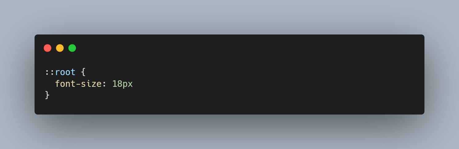
Rem (root elm - root element font-size) is a CSS unit that is relative to the font-size of an root element. This means that 1rem would be equal to the font-size of the html element which is usually 16px on most browsers.
They are both scalable units, they can either be scaled up or down, depending on the size of the element they are relative to. Using them gives our designs flexibility and this makes it easier to make the site responsive.
When are we to use either of them?
Using em
Em always inherits the size of it's parent element, this is made so due to the cascading nature of CSS. lets say you have a p inside of a div like
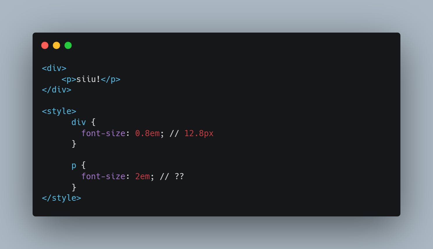
The p would have a font-size of 25.6px because it inherited the font-size of the div which it is a child of and multiplied it by 2. However, due to how confusing this can get, it is advisable not to use em for font-size.
This doesn't mean that em can't be used for other things, em is helpful for margin and padding, it makes them scale better.
Using rem
Generally, the default font-size of websites is 16px this would mean 1rem would be 16px. However, this can be overridden by:
Using rem makes the development process slower than normal because we would always need to calculate the rem value before making use of it. this gives the developer some freedom though and it doesn't affect the site's accessibility.
Em vs Rem
In as much as em and rem are similar in the sense that they are both scalable units and they are both relative to something, they differ in the way the browser converts them to pixels.
As we've said before, em values are relative to the font-size of the parent element and rem is relative to the size of the root font-size which if not set is usually 16px. This means that if the value of the root element font-size isn't set, 1rem would be equal to 16px and when it is set to 10rem, it would be translated as 160px.
This shows that using rem is very predictable and as a result of this, the way elements scale across devices can be controlled from one source. This can be done as shown below:
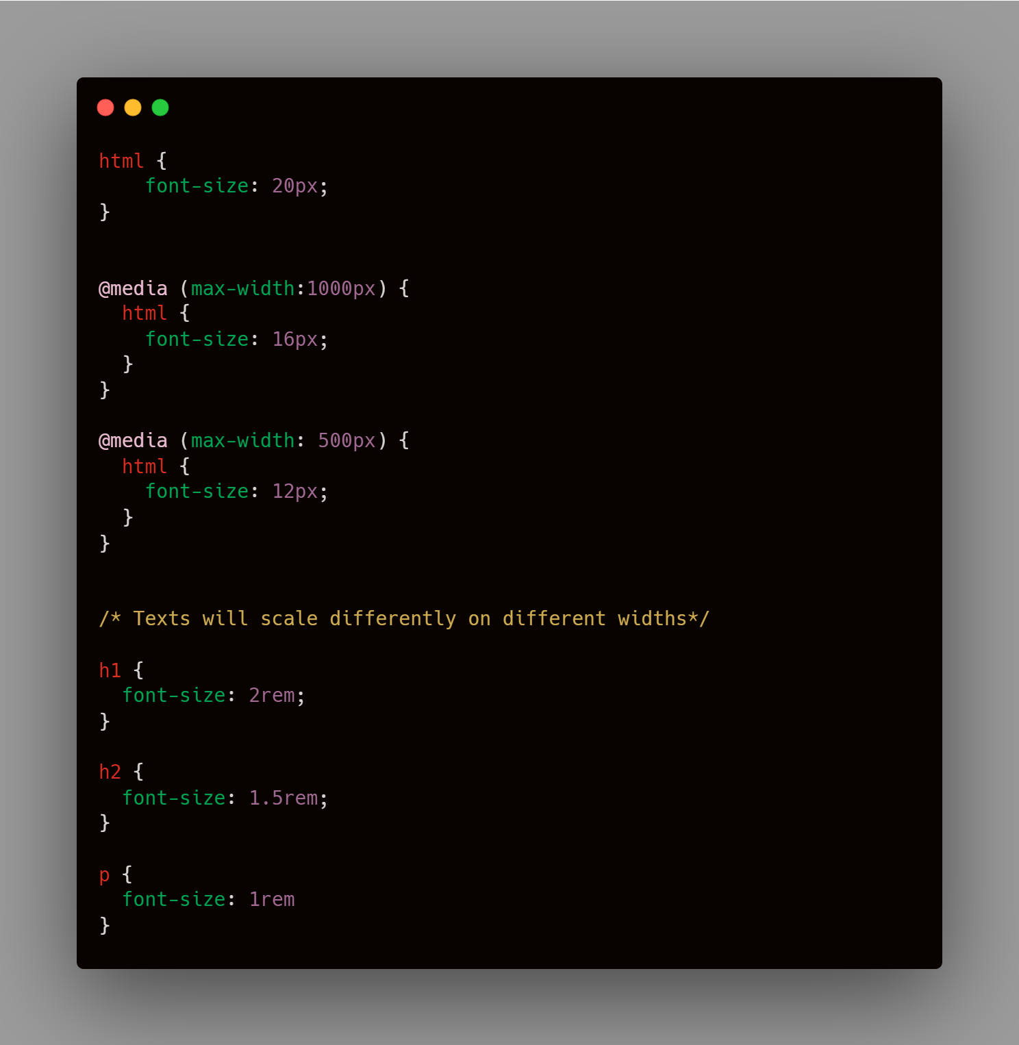
The result of the code above would be that the font-size would differ depending on the screen size. It is advised to use a % instead of a px when defining then root font-size because the px would override the default value in the user's browser.
It was mentioned earlier that rem values were more predictable, but they don't always give us the control and result we desire because it is difficult to scale a website using only one declared value.
Em is actually superior in this sense because due to the fact that it is dependent on the font-size of the nearest parent, this makes us have more control and helps make the page more scalable.
This doesn't mean that em doesn't come with it's own problems, One of the main problems with em is it's inheritance, because when you have multiple nesting elements, the em values begin to compound.
Conclusion
Both em and rem are scalable units, and can help make your design process more scalable and easier. But the big question is when should either of them be used? What I'll say is that you should use rem when you want predictability and consistency, then em should be used if you're trying to scale your page hierarchicaly.